OVERVIEW:
- Flexible - This layout with it various sections will accommodate any kind of messaging.
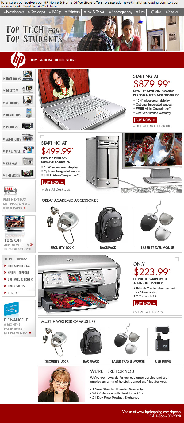
- Color - This layout is designed to let the grayscale products Pop. We'll use only one dominant color. There will be no colored borders.
- Boxed layouts - Layouts contained in boxes allow us to utilize Big Products.
- Visual Navigation - Also called the 'Viz Nav' this is the navigation on steroids. Why put the Navigation in there twice? Because it consistently gets clicks. We hope to capitalize on that.
- Smaller Left Rail - We keep the left rail but reduce it. This will still allow it to make an impact and get clicks, but it helps to reduce the clutter. A large column paired with small left column is easy to scan. Plus, with a less-wide left rail, there's no reason to fill it with something. If you've got nothing in the left rail, no problem, it still looks fine. In fact we recommend it.
- Theme box - Area at top allows us to set a lifestyle based theme. Don't have a theme? No problem, simply remove it and the layout still functions perfectly.
- 3 & 4 Product Grid - Can be positioned anywhere in the layout and can be stacked to create a large product thumbnail grid. Notice very small copy. Little or no copy keeps this section looking good.
- Big Products - Customers demand it. With the boxed layouts we can deliver product photography with improved details and visual textures.
- Banner - Can be used for anything. Products, partners, sweepstakes, anything. Very flexible for any promotional need.